Context
Questions often arise after a medical appointment: something was unclear, a patient needs further guidance, or the next appointment is months away. The platform gives patients a structured way to contact their doctor and gives doctors a way to receive payment for answering follow-up questions.
Doctors invite their patients to join and set their own package prices. Patients purchase question packages for a specific doctor, and the platform collects payments and pays doctors monthly. The interface is in Hebrew and reads right to left.
I joined at the idea stage. Through meetings with the founder and the developer, I created the initial product specification, then designed the patient and doctor flows, the interface and a shared component library. Early doctor homepage concepts supplied by the founder served as additional input for defining the information and functionality.
The challenge
The platform needed to support two connected experiences.
Doctors needed to identify questions awaiting a response, access the relevant conversation and manage the business side of their service. Patients needed to understand how the service worked, ask a question and keep track of conversations and packages across their doctors.
My focus was on making the next action clear for each user while keeping the relevant information within reach.
Helping doctors prioritize responses
- Pending questions first
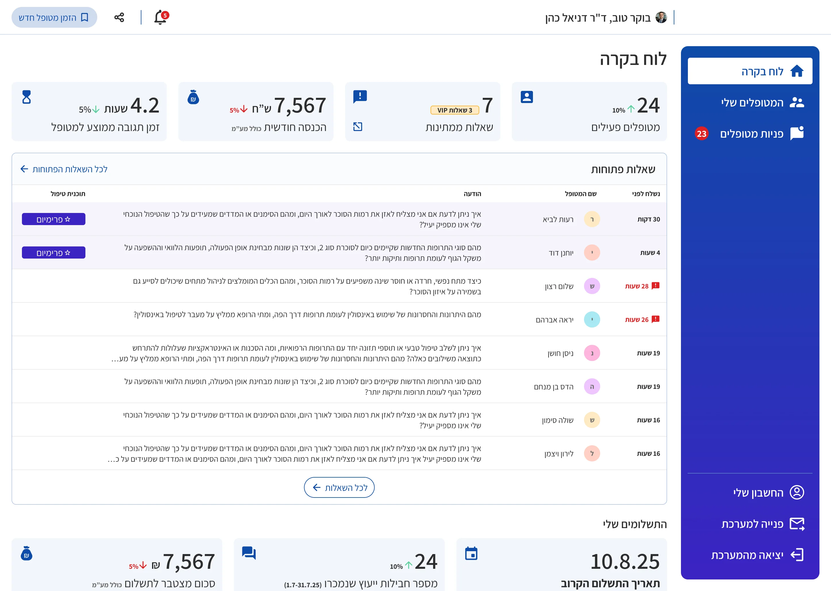
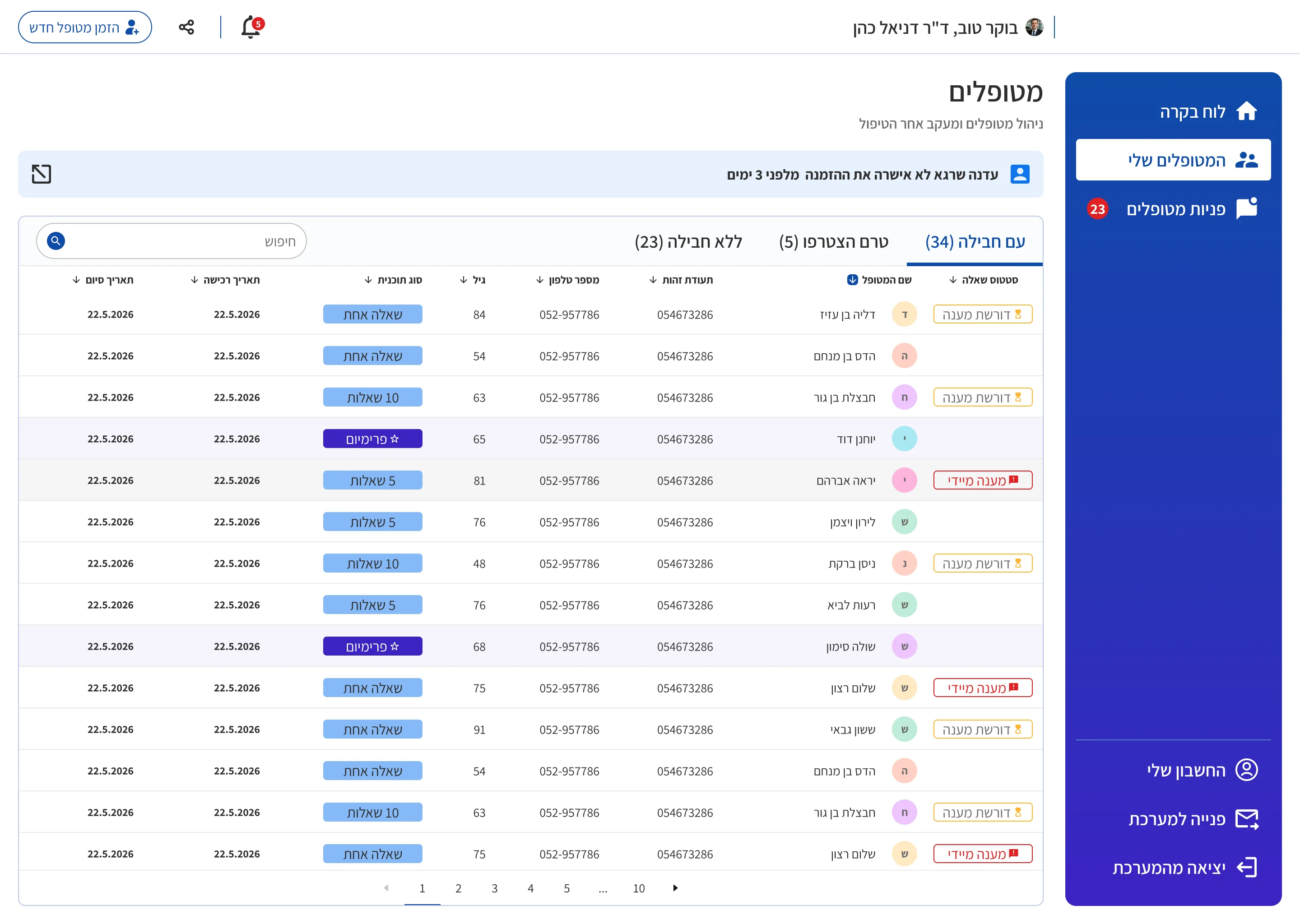
- I structured the dashboard and “My Patients” around patients with open questions. During the design phase, the service requirement was a response within 24 hours, with priority given to VIP patients who had purchased the larger package. This requirement guided the information hierarchy: doctors should first see who needs a response and have a direct route to the conversation.
- Access from different starting points
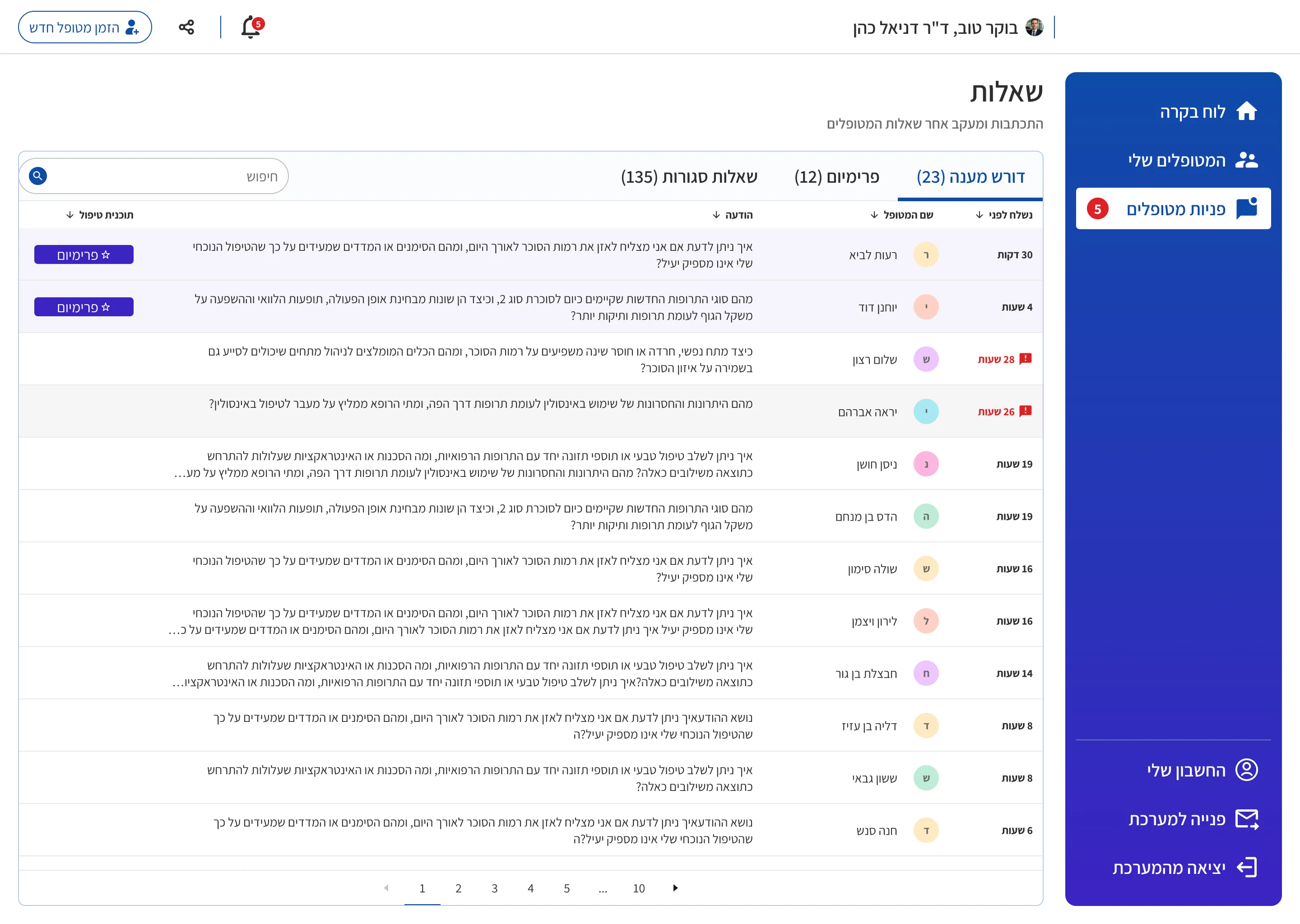
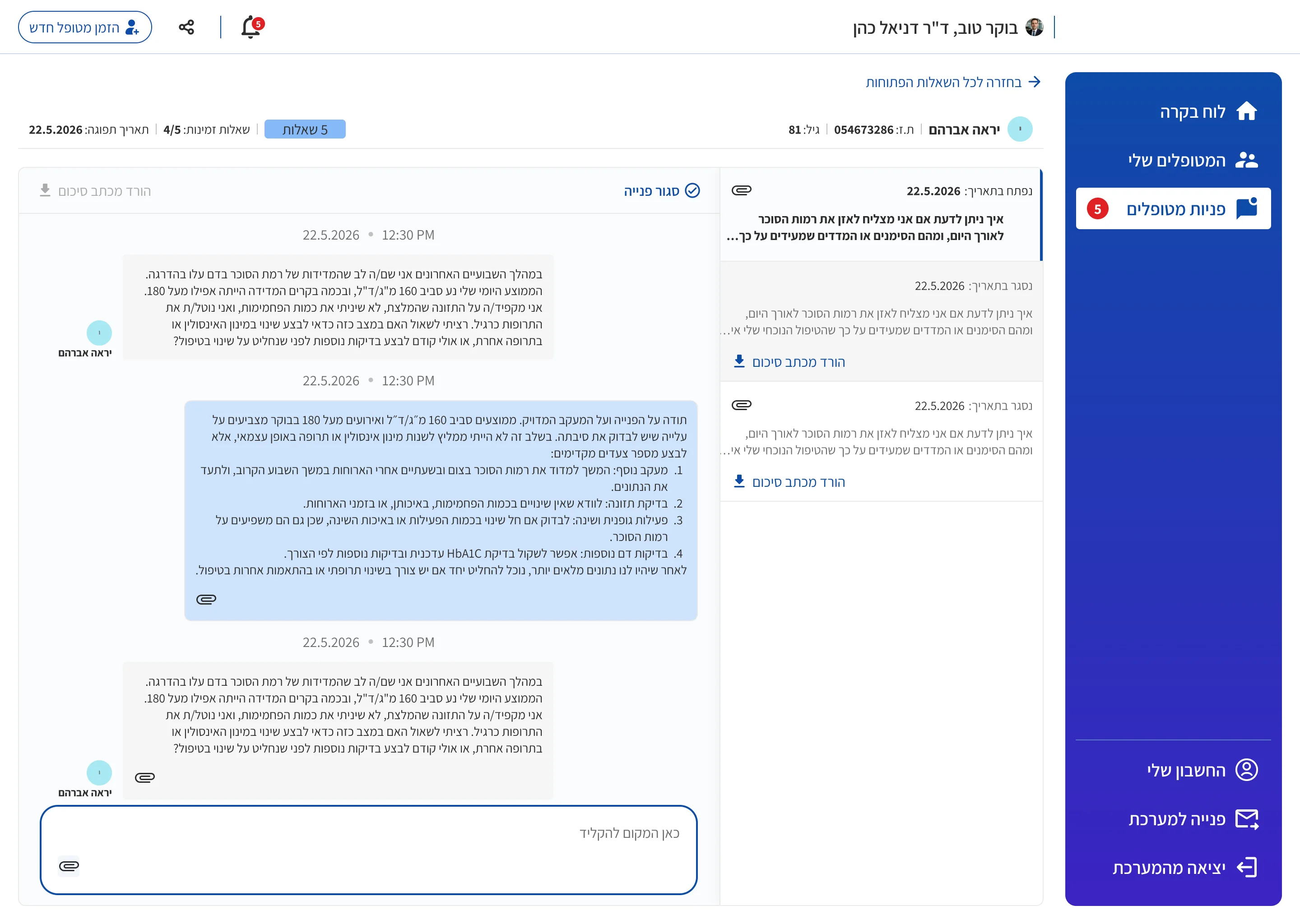
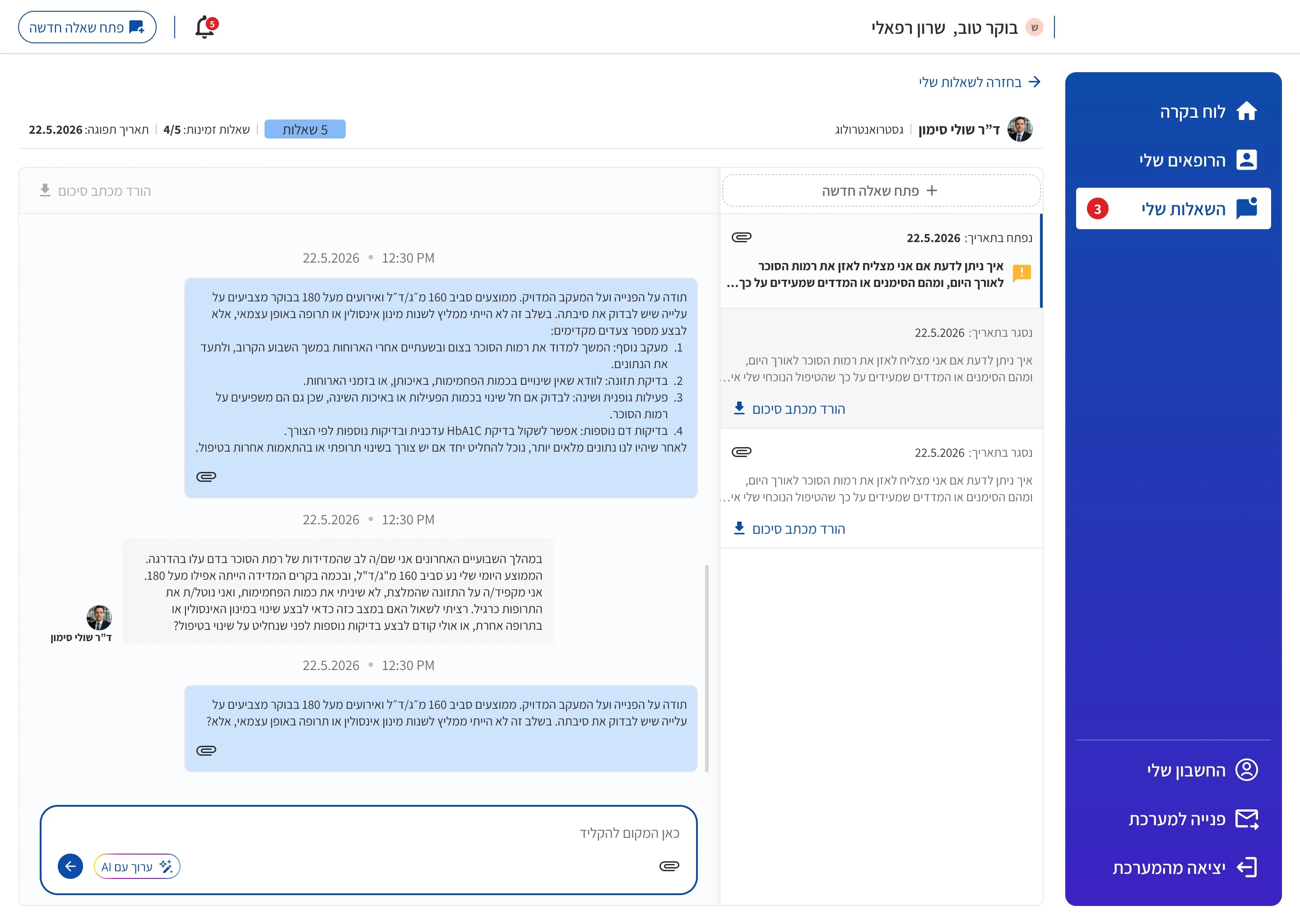
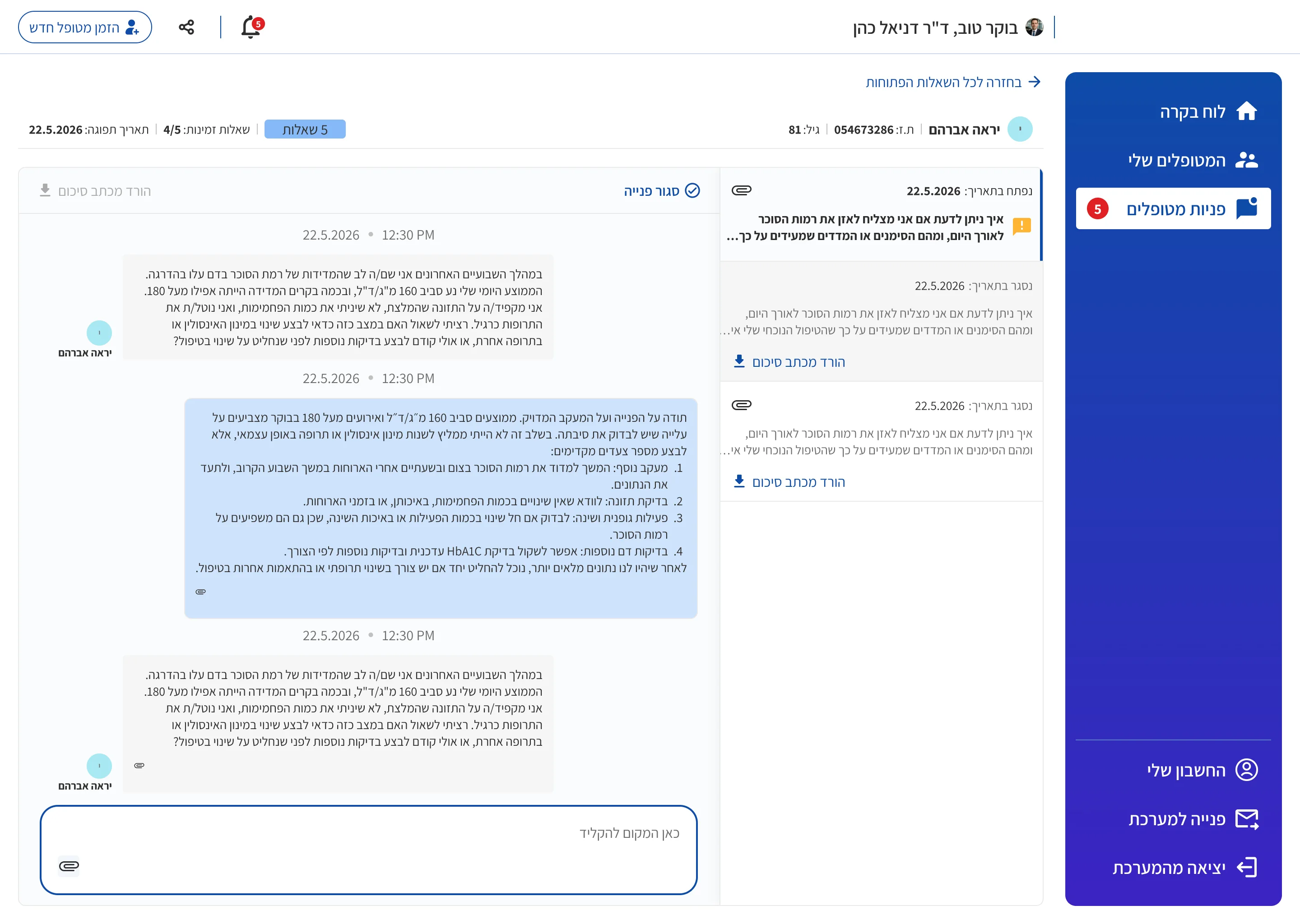
- Doctors look for a conversation in different ways: sometimes by who is waiting, sometimes by a specific patient. So a conversation opens from either the inquiries table or the patients screen, and doctors stay within the context of their search. Inside the conversation, a menu leads to earlier conversations with the same patient, keeping the history in view while writing a response.
- Patient invitations always available
- The platform stays open on the doctor’s computer, so I placed the invitation action in the persistent application frame. At the end of an appointment, the doctor can invite the patient on the spot, which also makes registration easier for older patients.
Making the service easier for patients to use
- A first question before purchasing
- I recommended offering a free first question and allowing patients to skip purchasing during registration. The aim was to let them experience the service before committing to a paid package.
- A question is always within reach
- The action to start a new question remains available in the application frame, mirroring the persistent patient invitation action on the doctor’s side.
- Two routes to a conversation
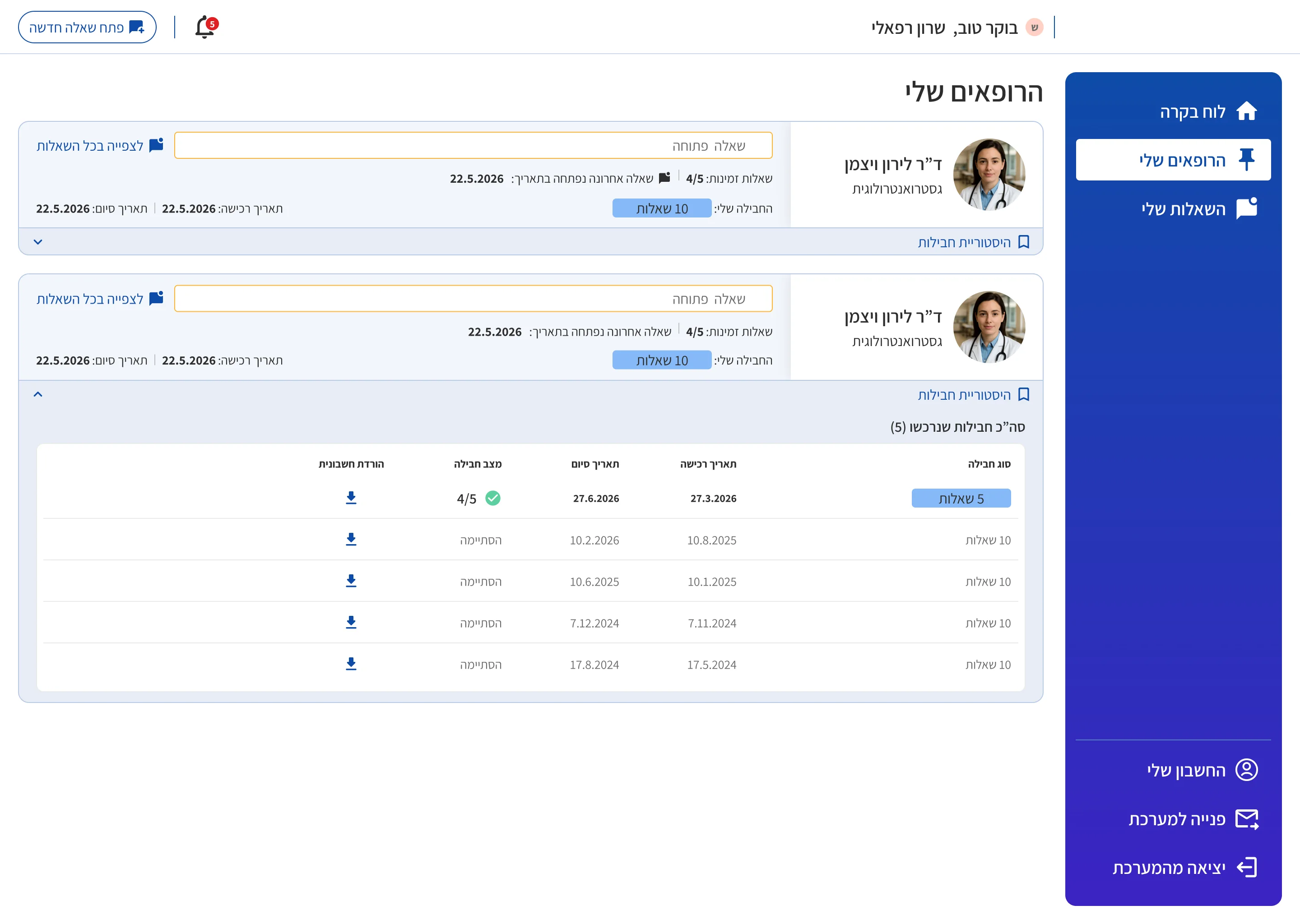
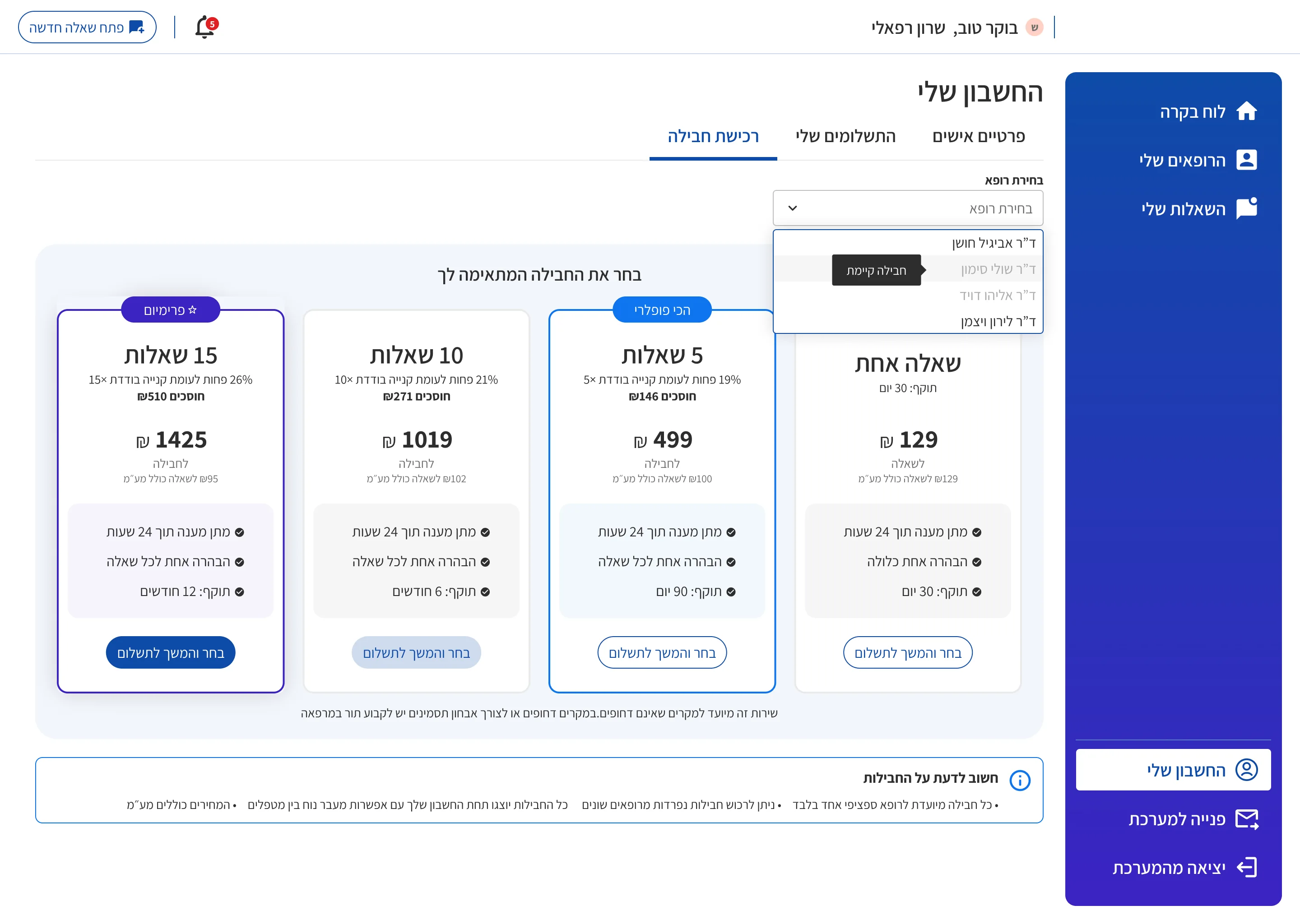
- As on the doctor’s side, patients reach a conversation from wherever they started looking: their doctor list or their questions screen, where open and closed questions appear in separate tabs. The doctor list shows whether there is an open question and provides access to package history. When no package is available, a purchase button leads to the account area, where the patient selects a doctor and package.
- Clear roles within the conversation
- Doctors and patients use a similar conversation layout, with actions adapted to each role. Only patients can start a new conversation, since each one comes out of their package. Doctors close a conversation when they have finished answering, and if they want to add something later, they can reopen it without using up another of the patient’s questions.
Bringing the doctor’s account together
“My Account” brought together several different needs: package management, payment tracking, public profile details and availability settings. Two of them carried most of the design work.
In package management, doctors set their own package prices, and an income simulator beside the prices shows what their pricing could mean for their income.
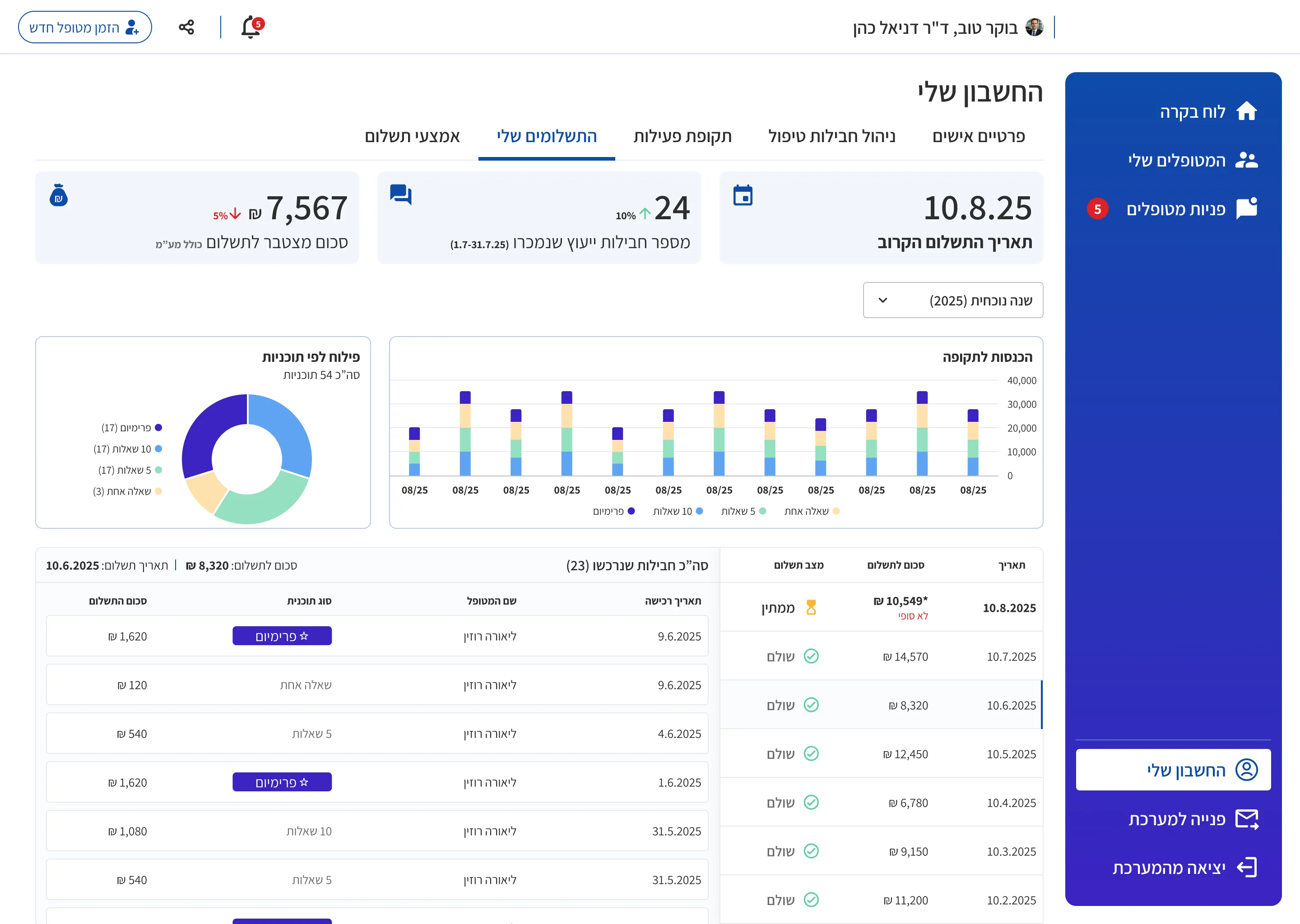
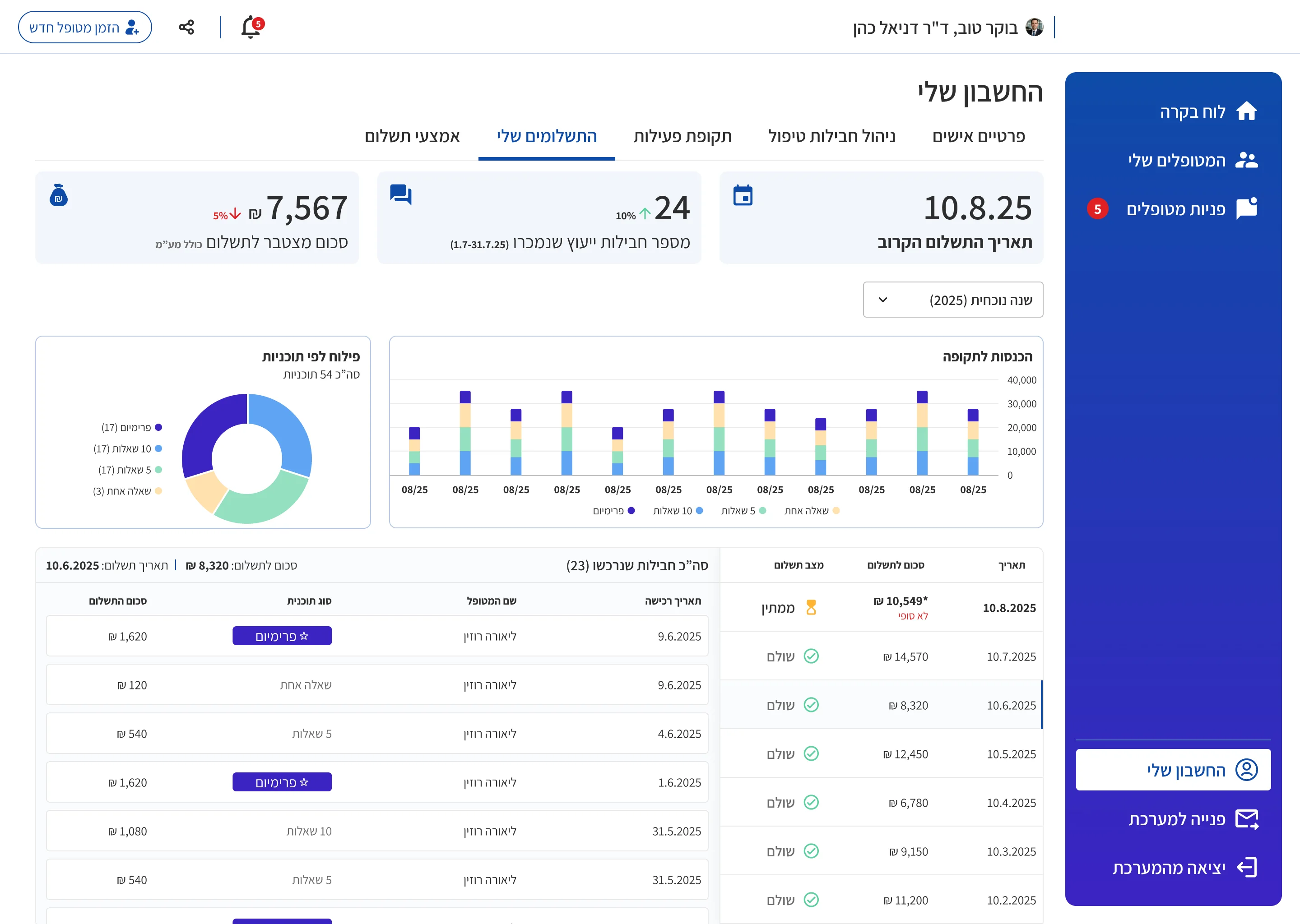
In payment tracking, I designed a view that connects the overall financial picture with individual invoice details.
Filters by date range and plan let doctors examine a specific period or package type. Summary charts at the top reflect the selected filters. Below them, an invoice list sits alongside the details of the selected invoice, allowing doctors to review individual records within the same screen.
A shared component library
I created a visual language and reusable components across the doctor and patient experiences, including tables, dashboard summary and analytics components, and the conversation interface. Every component was built with responsive behavior in mind from the start.
The shared conversation component supports both roles through different actions. Reusing components kept the platform consistent and made development easier.
The founder and the developer also used the component library to build the admin interface themselves.
Outcome
The platform has launched.
- LaunchedBuilt from my product specification and interface designs, for doctors and patients.
- Admin built from my libraryThe founder and the developer built the admin interface themselves, using my component library.
- Two QA rounds before launchI reviewed the built product twice before launch.
The QA rounds focused mainly on the UI, but also on whether the flows worked as intended, especially registration, which changed considerably during development. I also checked how the screens behaved on mobile, which led to mobile adjustments and to new designs for some of the widgets.